Wednesday, 6 March 2013

DVD Cover Layout with Sketches


Before I began creating my DVD cover I created a layout of how I wanted my DVD cover to look like, the positioning of my image against others, logo, text. This layout will be just a rough plan as I may want to add stuff within the cover.
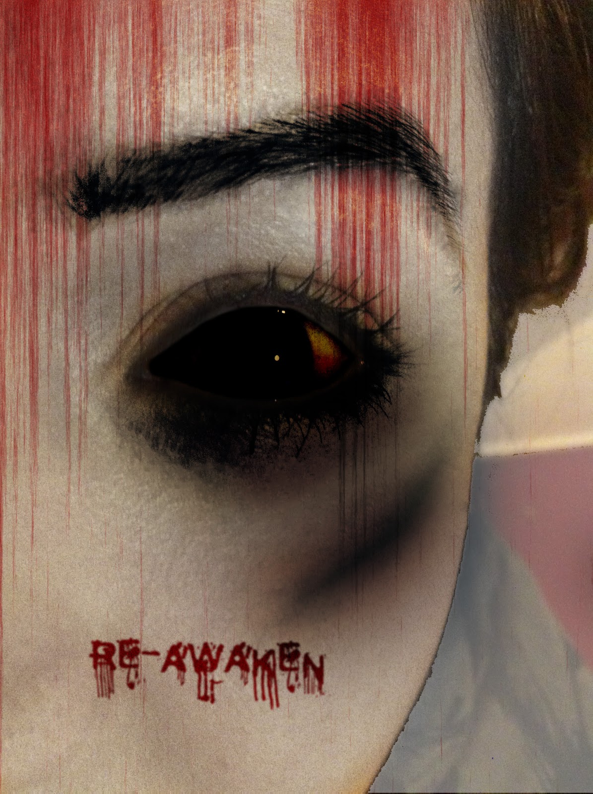
FRONT:I plan to have my image that I have been working on to go on the front of the DVD cover, this will be the whole of the image, I will not cut any of it out. The text at the front as I have discussed I will have as Trajan Pro, this will contain some effects like a glow or something that will make it stand out. Under this I plan to have the words "Based on a true story" in a much smaller font. 
SPINE: Across the spine I will have the title again, the exact same. With all the effects that have been used on the front cover. Then under this I will have the age rating and a DVD logo. 
BACK: As for the back of the cover, I will have the tagline at the top. Then under this I will have some images, from the scenes, perhaps a character. Then after all this I will have text, the text here will be descriptive to the film itself. Then I will have some credits and information about the film rating etc. 


Tuesday, 5 March 2013

DVD Cover Research

DVD Cover
I have looked at a number of horror type DVD cover which I can get inspiration from when I begin to create my own DVD cover. The film covers I have chosen are from quite popular films, this was so I could create something as good.


A coherent thing about these covers is that they all have a colour theme and this is shown on the cover, which the way they have selected certain colours. The use of colours is very subtle, like the colour of the font or incorporating certain colours within an image. As I have research most horror films the colours black and red are very commonly used, I will also be using.
Looking into the DVD covers in more details, I have noticed that some films like to use quotes from critics or views of their opinions of the film Like for example paranormal activity have at the front of the cover- “The most anticipated horror even of 2010. Steady nerves. Your sleepless nights are about to return”and the back of the film at the top they have the words- “Paranormal activity 2 succeeds by giving us another dose of what worked the first time around” –quoted by Film.com. Some films have the words “Based on a true story” or something similar. I like this idea it entices the viewer to watch the film and something I will look into doing for my own cover. The front of the cover is usually simple, it uses just one image leaving the back to reveal more images, and contains a title and lines of words.
All four films have on the back of the cover snapshots of images taken from scenes in the movie. I have also noticed they show the faces of the character playing in the film. The set out of the snapshots of three of the movies are the same, so I may look into doing something similar. All of the films also have an overview of the film without giving too much away, this is usually located at the back of the DVD.
Finally all DVD covers must display the DVDs certificate rating, clearly at the front of the film or back, films like to place it on both front and back. Also a barcode usually displayed at the back of the film cover.


Monday, 4 March 2013

Finalised Front Cover Image

This is my final front cover image, further into creating my DVD cover I may want to change or add some bits to my image but for now I have pleased with the current state as it is what I envisioned when I was planning for this.
Now that this part of the task has been complete I can now start to plan for my DVD cover, and begin to create it. This image here will be used for the DVD cover, it will be the front image, I may add other things onto the image. 

Adding Back Light


Using levels and Pen Tool 
Since my last post I have created a back light around the font, which makes the font stand out from all the dark that the image contains and I wanted the text to be a focus and not lost in the image. To begin with I created a path using the Pen Tool (Path > New Path), I didn't want the shape to be a standard rectangle. With levels you move the pointer and it goes from light white to a dark black. In the screenshot you can tell it does slightly affect the rest of the image which I like. I have taken the point to the light colour so that the extent it can go to can be shown. I have gone somewhere in the middle so that its not to light or not to dark. 


Sunday, 3 March 2013

Adding Text

Using Pen Tool and Horizontal Type Tool

My image now has a title, I was unsure what to name my film but I was given suggestion by people, I particularly liked the name Re-Awaken from the word reawaken but with a hyphen. The word reawaken means to awaken once again and “to become awake or make aware of (something) again”, this words already sets out my storyline, I can have this girl who is awaken from the dead. With just this word people can sort of get what the film may be about, like with some films the title sets what the film will be about for example The Grudge –it never forgives. It never forgets. Already as a viewer you know that this film involves a strong bitterness by the person who is dead due to a “powerful rage or extreme sorrow”.

I wanted to find the perfect font, something blood like because I already knew I wanted to use a red colour for the font. So I went through the entire font that Photoshop provided and I was not satisfied with any of these as it was not what I was looking for, it didn’t fit the look I was going for. So I decided I should download a font onto Photoshop, I searched for some fonts for Photoshop. This is when I came across a site called Dafont which is a site with hundreds of different fonts and all for free. I looked through the different fonts and found one which had the look I was going for. The name of the font was called Cold Night for Alligators, then all I had to do was to download the font into Photoshop. I had never done this before so I found a video on Youtube which showed me how to do exactly this.


Creating Fibre Effect to Image

Using Masks, Blend Modes, Render-Fibres, Hue/Saturation

Since the last post I have coloured the back of the face and I applied a render to the face, which left streakes going from the top of the image to the centre, these are red streaks.

I have used a Mask to cover the face part of the image and allow the rest of the image to be manipulated. The eye and eyebrow remain the same, it has not affected these. I chose to go for a grey colour, it was between grey or black from the opinion of others grey looked better. I used a blend mode here. The blend mode was Luminosity, there were other blend modes that were a different shade of grey but I think overall this colour fit well with the image. Although this looks good, there is a slight harshness between the face and the background, it is not a smooth line. So I may have to look to make it more smooth experimenting different tools I can use to allow me to do so.

Another change I made was the red lines you may see in the finished image below. I did a Render Fibres Filter on a different layer. I changed the Variance and Strength until I liked the look. I also changed the levels of the waves, the input and output levels until I achieved a nice contrast. I inverted the levels and changed the foreground colour from a grey to a red; I found the colour was a bit too bright so I decreased the Saturation. I also changed the Blend Mode to Colour Burn. I chose this because already you can see that my image is quite dark so I wanted to make the red darker to go with the darkness of the image as a bright red would not look as good.
To the layer with the fibres layer I altered the hue/saturation which masked just the fibres from the rest of the image. I then changed the saturation and the lightness of the image. Until the colour was not such as bright red but also not dark, somewhere inbetween.

I still think I need to darken the image a little more because it will then hide out the areas which are quite light but dark in others areas, like the eyebrow, around the eye and it will make around the face less harsh. I plan to do this by taking a snapshot of the image in Photoshop (CNTRL SHIFT ALT E) this will take a snapshot of all the layers and create a new layer for it. Then I can darken that layer by changing the Blend Mode. Taking this snapshot also means that I can delete all of the other layers, but I will not because if I want to change a certain part of the image like with the eye it won’t allow me to.

What I will do next:

- Finalise image

- Add title

- Shadow, black light behind title